When you’re tasked with putting together a presentation, it’s often expected that you’ll kick things off with an overview slide. Think of it as a quick peek at what’s coming up, giving everyone at the meeting the same expectations for what details you’ll eventually cover. But here’s the catch: it’s easy to get so caught up in building out the meat of your presentation, or to have a laundry list of other tasks that need attention, that the overview slide gets shortchanged.
If you leave that slide for the last minute, treat it as something you just have to get out of the way, or just update a few figures without really thinking about the bigger picture, you might start off on the wrong foot, with your audience scratching their heads over what you’re talking about and where you intended to go next.
Even when you are pressed for time, your overview slide can be dramatically improved in a short period of time by simply (1) editing out unnecessary detail, (2) keeping your formatting consistent and organized, and (3) adding a line or two of text to summarize the overall message.
We recently worked with a client—we’ll call them MetroLink Urban Railways (MLUR) to protect their confidentiality—who created this overview slide as part of a larger presentation that was meant to show how MLUR was performing both against its internal targets and the overall region.

Before we leap into what we’d change, let’s give credit where credit is due for the things that are done well. Firstly, no distracting visual elements are competing for my attention. I’m sure you can imagine a slide with images or icons used to depict the metrics. (Showing delays with a red signal image comes immediately to mind.) It’s a relief these distractions aren’t present. I also appreciate the bold-facing that has been applied drawing my attention to the key metrics: train capacity; number of journeys; delay hours; and the forecasts. Our company, MLUR, is always clearly identified.
That being said, consider your experience when you first glanced at this slide.
-
What information were you easily able to retrieve?
-
Was it structured in a way that made sense to you?
-
Were you confident you knew what the presentation was going to cover?
-
Could you quickly identify what the key points were going to be?
Making a few quick changes allowed us to strengthen this slide for our client. Let’s go through the revision process together, and see how you might do the same thing in your own organization.
Edit out unnecessary detail
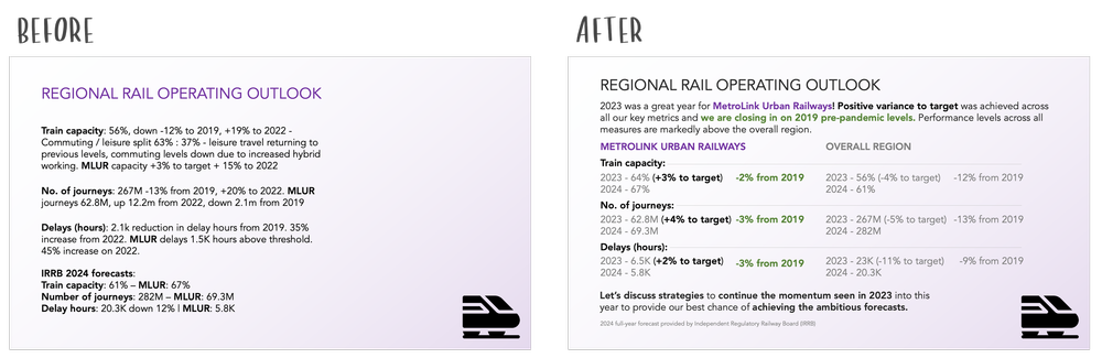
Ideally, you want the level of detail in your overview slide to hit that sweet spot between “too sparse” and “overwhelming.” As it stands, this slide tends more towards the latter. You likely need to spend a considerable amount of time understanding the level of the detail (overall market or MLUR specific), the type of variance (absolute or percentage), and the comparison being made (to previous years, or versus targets and thresholds).
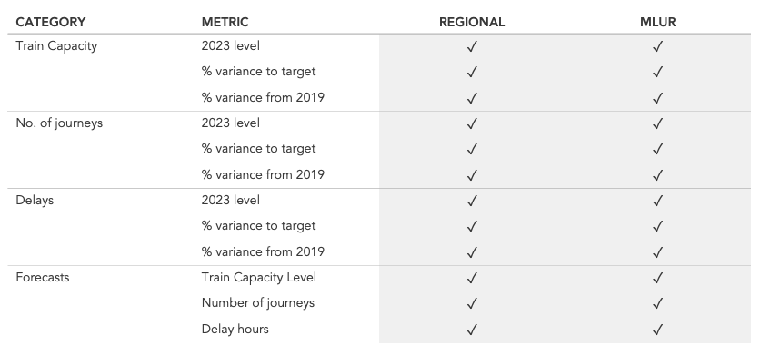
How do you approach editing out some of this detail? There are so many metrics here that in the process of working on this slide, you may want to make yourself a data table, just to categorize what was being shown. Listing out your metrics in a table like this can provide some immediate clues about where to refine.

Out of the 17 different metrics mentioned in the slide, just 6 (highlighted in grey) are used for both the overall regional numbers and MLUR. What’s more, some of these metrics seem incidental—not important to the story at hand. Other, more important metrics, are partially (or completely) missing.
It’s a trap that’s easy to fall into, especially when rushed: we just include all of the data we have, without giving too much thought as to whether critical pieces are missing, or if some of what’s included is no more than distracting trivia.
Let’s imagine that, together with the client, we revise what metrics are included so that we have a consistent and meaningful set of data.
Once consistency across the metrics has been established, you can apply these measures to the slide.

Keep your formatting consistent and organized
Once we’ve settled on the information we’ll include in our overview, we move on to re-thinking its layout. With the changes we’ve made so far, the slide feels less dense, but comparing MLUR to the region overall still requires considerable effort. For instance, how quickly can you determine whether MLUR is forecast to have more train capacity than the region overall? This question still takes some searching to answer.
As a general guideline, it is easiest to compare things that are physically close together. and consistently aligned with one another. Whatever comparisons we think should be easiest for our audience to make will inform how we lay out our information on the slide.
Currently, each metric is written out in text, as though it’s a sentence. This layout hampers our ability to easily scan the values of similar metrics. Instead, we can use a more grid-like structure, so that we have two vertical columns (one for overall region, one for MLUR), and then consistent horizontal rows for individual metrics and years. We use tab stops within individual lines, when multiple metrics appear, to make them easier to separate out from one another visually:

With this refresh, the slide is now much easier on the eyes, letting you scan through the info smoothly. Notice how much easier it is to see how things are shaping up not just in the area overall but also for MLUR, comparing their current performance against their goals for 2023 and even how they stack up to 2019. It’s clear from this view that MLUR is on a roll, hitting all its targets and getting closer to the kind of success they saw before the pandemic hit. Unfortunately, the same can’t be said for the region as a whole.
By placing the forecast figures right beneath the current achievements, we’ve made it a breeze to visualize what MLUR is aiming for in the year ahead, and what they’ll need to do to get there.
Make the overall message clear
While we have a much cleaner slide than before, the volume of data still demands that our audience make some effort to process it all. We can make this task easier with the use of an observational takeaway, careful use of colour to highlight specific areas, and a clear call to action. At this stage, we can move MLUR to the more prominent position on the left-hand side, which suggests to a reader that it’s the MLUR data that is of most importance, and the regional data only meaningful as a comparison to MetroLink.

You’ll notice that since the consolidation of the metrics, no data has been removed from this view. Even so, a far more effective and action-provoking slide has been achieved via a clearer layout and careful use of words. Not all of our data is visualised with charts and graphs but even with an overview slide like this a positive impact can be seen. Check out the before and after below.
For more examples of visual transformations, check out the before-and-afters in our makeover gallery. Then, practice honing your data storytelling skills by undertaking an exercise in the SWD community.
Source: Story Telling